Most med spa websites clear the design bar. Far fewer answer the question a patient is actually sitting with: can I trust these people with my face?
That’s a higher bar than simply having a pretty website.
Patients considering Botox, laser treatments, body contouring, or skin rejuvenation are making high-consideration decisions. Before they book, they’re evaluating your expertise, comparing providers, researching treatments, and deciding whether your practice feels like the right fit.
Your website plays a role in every step of that journey.
In this guide, we’re breaking down what the best med spa websites have in common, then highlighting 17 examples that demonstrate exceptional branding, user experience, and design that actively moves patients toward booking. These aren’t ranked from best to worst. Each does something particularly well, and there’s something every aesthetic practice can learn from them.
What makes the best med spa websites?
After reviewing dozens of aesthetic practice websites, we’ve noticed that the best ones treat design as a conversion tool, not just a visual one. Every choice — colour, typography, photography, layout — is doing a job.
Clear positioning, established visually. Within a few seconds, the colours, typography, and imagery should tell a visitor who the practice is and why they’re different, before a single word of copy is read. Many med spa websites jump straight into listing treatments. Stronger websites establish the brand behind those treatments first, because patients decide whether to trust a practice long before they decide which treatment to book.
Layout that removes friction. Good design isn’t about adding more animation or making every section look different. It should guide visitors naturally toward a decision, whether that’s a single service, a filtered list, or a booking button. The fewer clicks and less second-guessing between “interested” and “booked,” the better the design is working.
Photography that builds trust before the copy does. The strongest websites rely on real provider photography, authentic treatment imagery, and a cohesive visual identity. Patients want to see the people they’ll trust with their care. Authentic photography does real conversion work: it lowers the anxiety of a first visit before a patient ever reads a treatment description.
Trust signals placed where the decision actually happens. Reviews, star ratings, credentials, and provider bios convert best when they sit right next to the moment of decision — on a provider card, next to a price, inside a hero — rather than tucked away on a single About page.
A conversion path that never gets buried. Booking should feel obvious no matter how deep into the site a visitor scrolls. The best-designed sites keep a CTA visibly and stylistically consistent, so it’s never a hunt to find the “Book Now” button.
Our favorite med spa websites.
DRIP Medi Spa
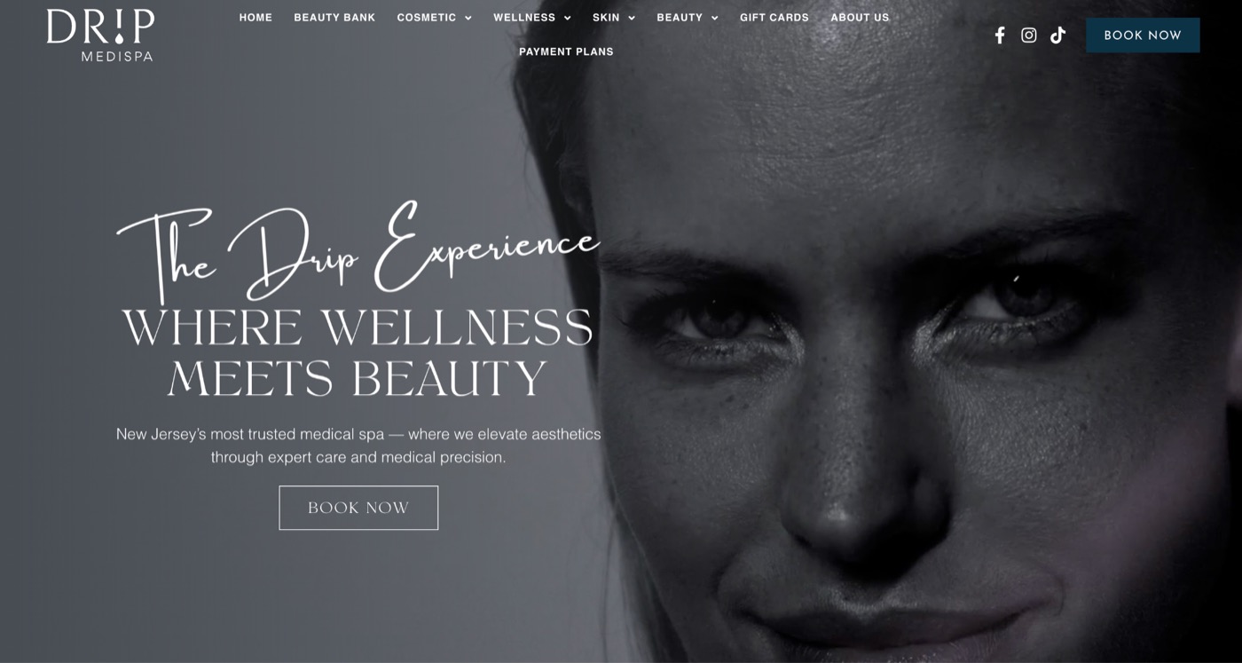
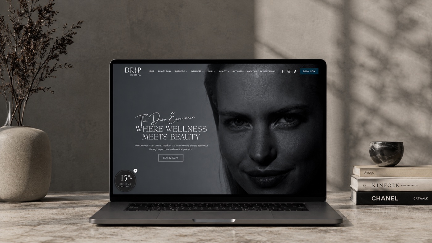
DRIP Medi Spa shows how motion can be used without overwhelming the experience. The full-screen hero video immediately creates atmosphere, while the delicate handwritten “The Drip Experience” layered over bold sans-serif typography adds just enough personality to feel premium without becoming distracting.
Throughout the site, modern layouts, intuitive navigation, and consistent branding make it easy to explore treatments while maintaining a sophisticated visual identity. It’s a great example of using video to strengthen a brand rather than simply adding movement for the sake of it, and that kind of cinematic first impression is exactly what makes a visitor remember DRIP by name days later, instead of filing it away as “one of the med spas I looked at.”
Skin Secret Aesthetics
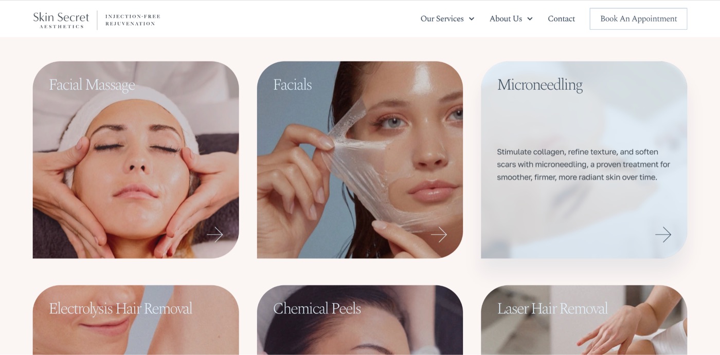
Skin Secret Aesthetics keeps its visual language clean and refined, allowing treatments and provider expertise to remain the focus.
One detail we particularly love is the services featured prominently on the homepage. The 9-image grid uses a variety of photography that is unified by a subtle filter, so although the images are different, the visual effect is not disjointed. The hover effect reveals a light blue background and a description of that service, making it engaging and encouraging the user to click to read more. That click leads to a thorough service page with all the details on what a patient would want to know before booking a new treatment. This is where conversions happen, and Skin Secret clearly knows it.
Skin Concept + Laser
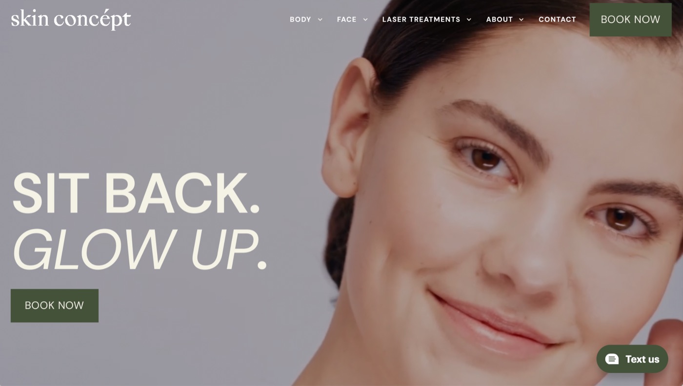
Skin Concept + Laser proves that confidence often comes from restraint.
The homepage opens with a tightly cropped portrait paired with a simple two-word headline: Sit Back. Glow Up. Rather than trying to explain everything immediately, the design trusts visitors to continue exploring. That confidence, combined with clean layouts and well-organised service pages, creates an experience that feels polished without unnecessary complexity, and that restraint reads as confidence in the work itself, which is often more persuasive to a skeptical first-time patient than a page full of reassurances would be.
Puresthetique
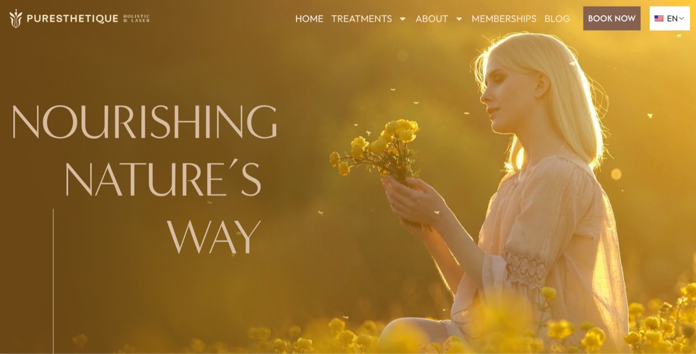
Puresthetique immediately distinguishes itself from the typical med spa aesthetic.
Instead of clinical interiors or close-up treatment photography, visitors are welcomed with beautiful golden-hour imagery of a woman in a flower field. The emotional tone is completely different from most aesthetic websites, creating a feeling that’s softer, more aspirational, and highly memorable.
It’s an excellent reminder that great branding doesn’t always have to look clinical to communicate professionalism. And that softer, aspirational tone sets a premium expectation before a visitor has seen a single price, which matters when the goal is attracting patients who value the experience as much as the outcome.
Soul Wellness & Beauty
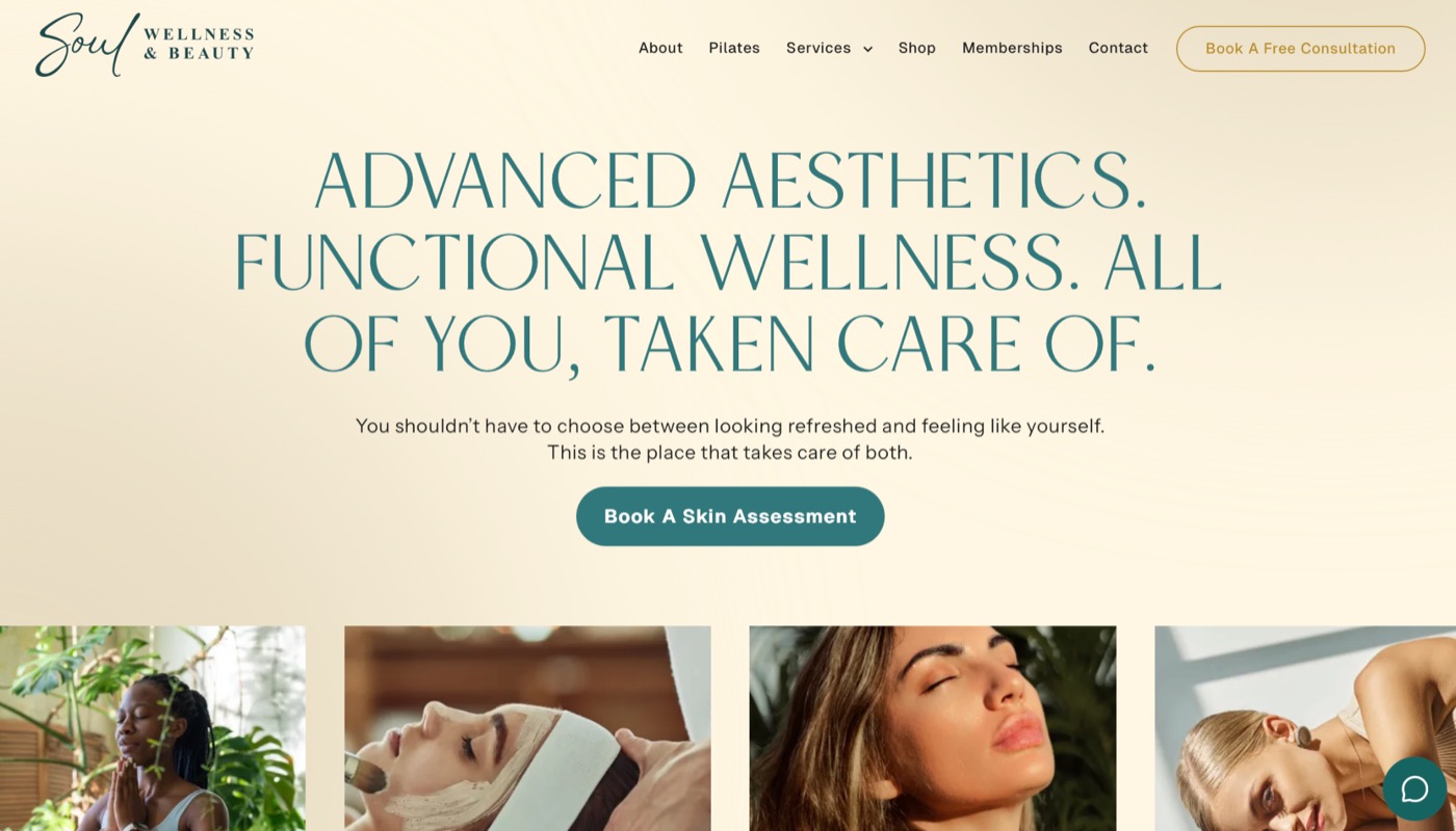
Soul Wellness & Beauty strikes an impressive balance between luxury and warmth. The cream colour palette, deep teal serif typography, and generous whitespace create a calming first impression that feels more boutique retreat than medical clinic.
One of our favourite details is the four-image strip immediately below the hero. Rather than overwhelming visitors with a long services menu, it previews the practice through a curated mix of treatment, lifestyle, portrait, and wellness photography. It’s a simple design choice that immediately communicates the breadth of the practice while reinforcing the brand’s relaxed, elevated personality — and it lets a first-time visitor self-identify with whichever photo feels most like them before they’ve read a single service name, so the site does the work of narrowing down options rather than leaving the patient to guess.
Paradise Medspa
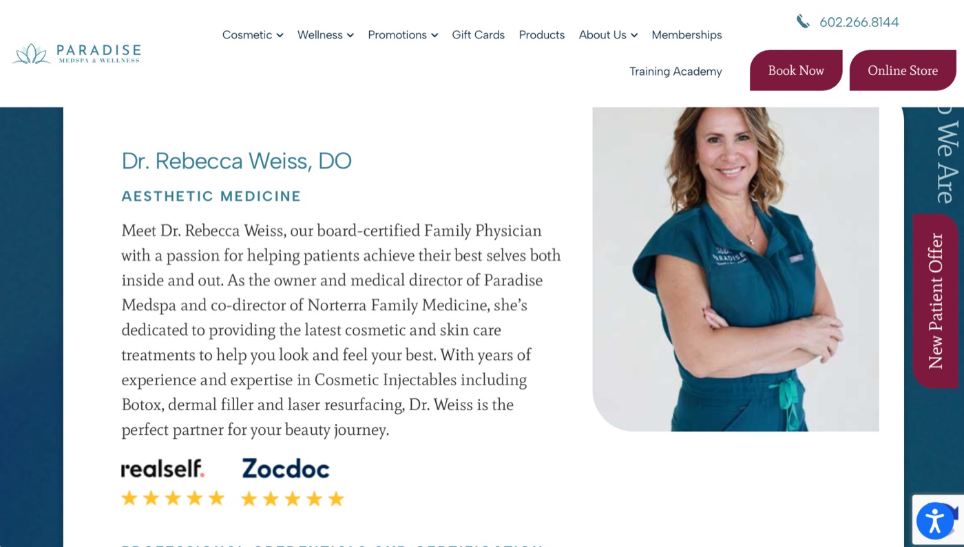
Paradise Medspa builds trust directly into the decision-making moment. Rather than saving credibility for a single About page, provider bios display RealSelf and Zocdoc star ratings right alongside each doctor’s photo and credentials — a specific, third-party trust signal that matters enormously for a category like injectables, where “who’s actually doing this to my face” is the real question a patient is asking.
The homepage reinforces this with a press-mention bar (Arizona Republic, Top Doctors, PRWeb) placed right under the intro copy, before a visitor has scrolled to services. Combined with tabbed service categories and rounded, image-forward cards, the site turns credibility into something visitors see rather than something they have to go looking for, which does more to settle a nervous first-time patient’s nerves than any amount of reassuring copy could.
Kate Somerville
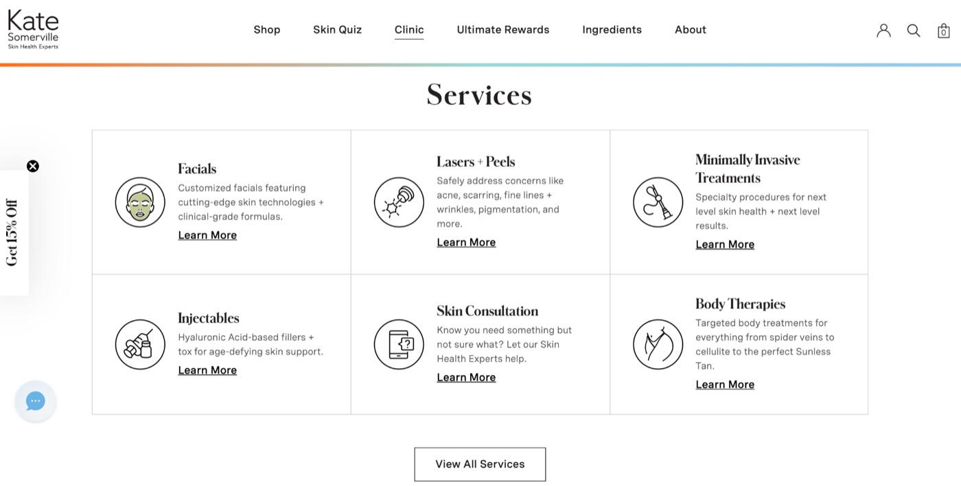
Kate Somerville’s clinic website is one of our favourite examples of combining luxury branding with exceptional usability.
One feature we particularly appreciate is the icon-based services grid. Rather than presenting visitors with a long list of treatments, the website groups major service categories using clean line icons that make navigation feel effortless and highly scannable. Combined with refined branding, educational treatment pages, and outstanding photography, it creates a patient experience that feels both elevated and intuitive — and because the icons do the sorting instead of a dense text menu, patients find their way to the right treatment page without ever feeling like they’re reading a medical brochure.
Hi, Finch
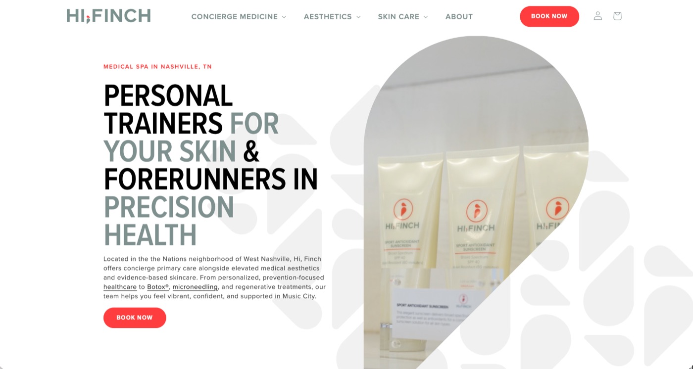
Hi, Finch stands out because it refuses to look like every other med spa website.
The homepage features bold editorial typography alongside custom teardrop graphics instead of leading with the typical provider portrait or treatment imagery. Headlines like Personal Trainers for Your Skin immediately establish a distinctive brand voice, proving that originality can become one of a practice’s strongest competitive advantages, since a headline like that is far easier for a patient to describe to a friend than “that med spa with the nice pictures.”
Marina Medspa
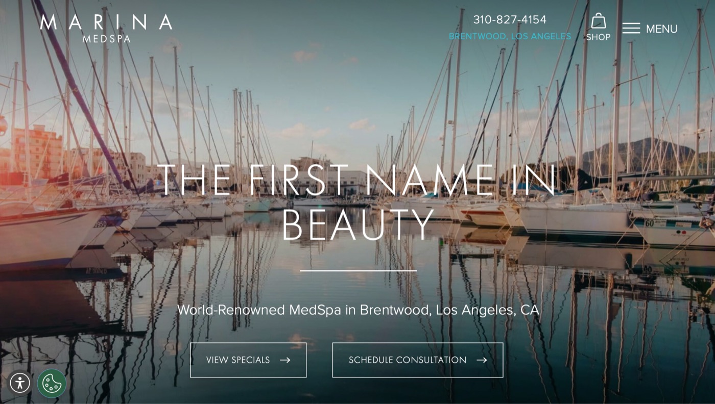
Marina Medspa does an excellent job connecting its brand identity with its location.
The homepage features expansive marina photography paired with a clean, centred wordmark, immediately reinforcing both place and personality. Rather than feeling generic, the website creates an immediate sense of destination that supports the overall brand experience. And for a hyper-local service like this, that instant sense of place helps local visitors quickly understand where the practice fits into their community.
Vive Med Spa Denver
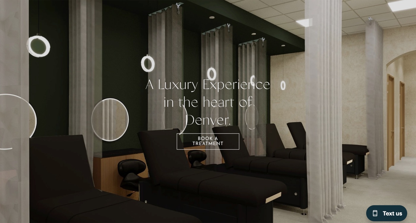
Many aesthetic websites rely heavily on stock-inspired model photography. Vive Med Spa Denver takes a different approach by showcasing its actual space. The homepage hero features the clinic’s interior, including architectural details and branded signage, grounding the brand in a real environment. It helps visitors visualise where they’ll be treated before they ever step through the front door, creating an added layer of familiarity and trust, directly addressing one of the biggest hesitations a first-time patient has before booking an unfamiliar clinic.
Facile
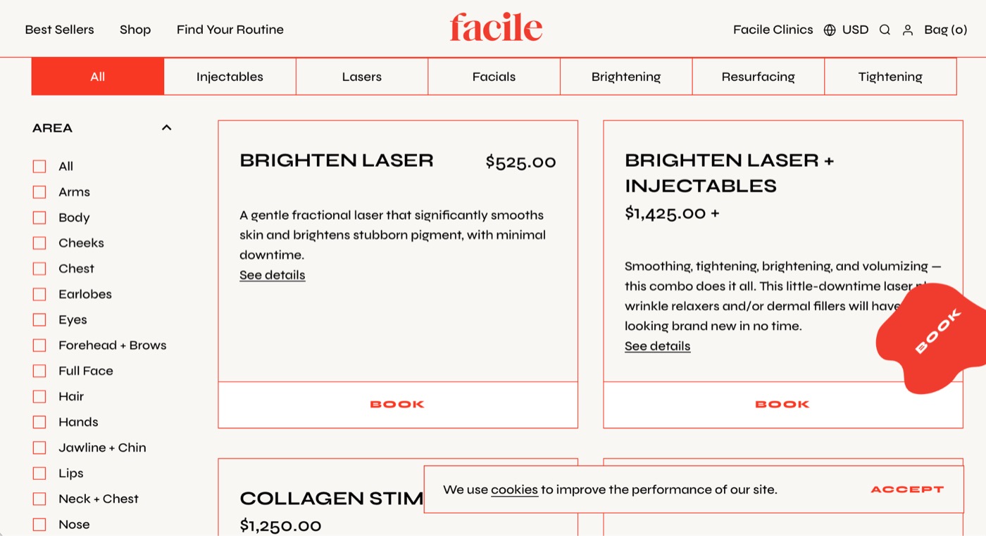
Facile may be the most distinctive website in this collection.
Its bold coral branding, fashion-inspired photography, playful hand-drawn “BOOK” sticker, and highly curated layouts create an experience that feels closer to a premium skincare brand than a traditional med spa.
Our favourite feature, however, is the treatments page. Rather than presenting a long list of services, patients can filter treatments by concern, treatment area, downtime, and price using an e-commerce-style faceted navigation system. It’s one of the strongest design-to-conversion moves in this entire list: patients who don’t know the name of the treatment they need can still self-select by goal, which means the site is doing some of the discovery work a consultation would otherwise have to do, turning uncertain browsers into more informed prospective patients.
Ever/Body
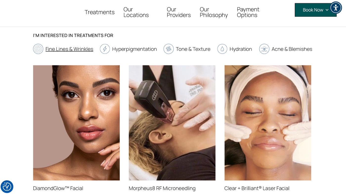
Ever/Body has become one of the strongest examples of polished digital branding within aesthetics.
The clean typography, spacious layouts, and restrained visual style create an experience that feels approachable without sacrificing sophistication. We particularly like the “Shop by Concern” navigation, allowing visitors to browse treatments through concerns like fine lines, hyperpigmentation, or texture instead of navigating an overwhelming treatment list. It’s a simple UX decision that aligns much more closely with how patients actually think. And organising the whole treatments page around that mental model means a visitor never has to translate their own goals into medical terminology just to find the right page.
Juliana Clinics
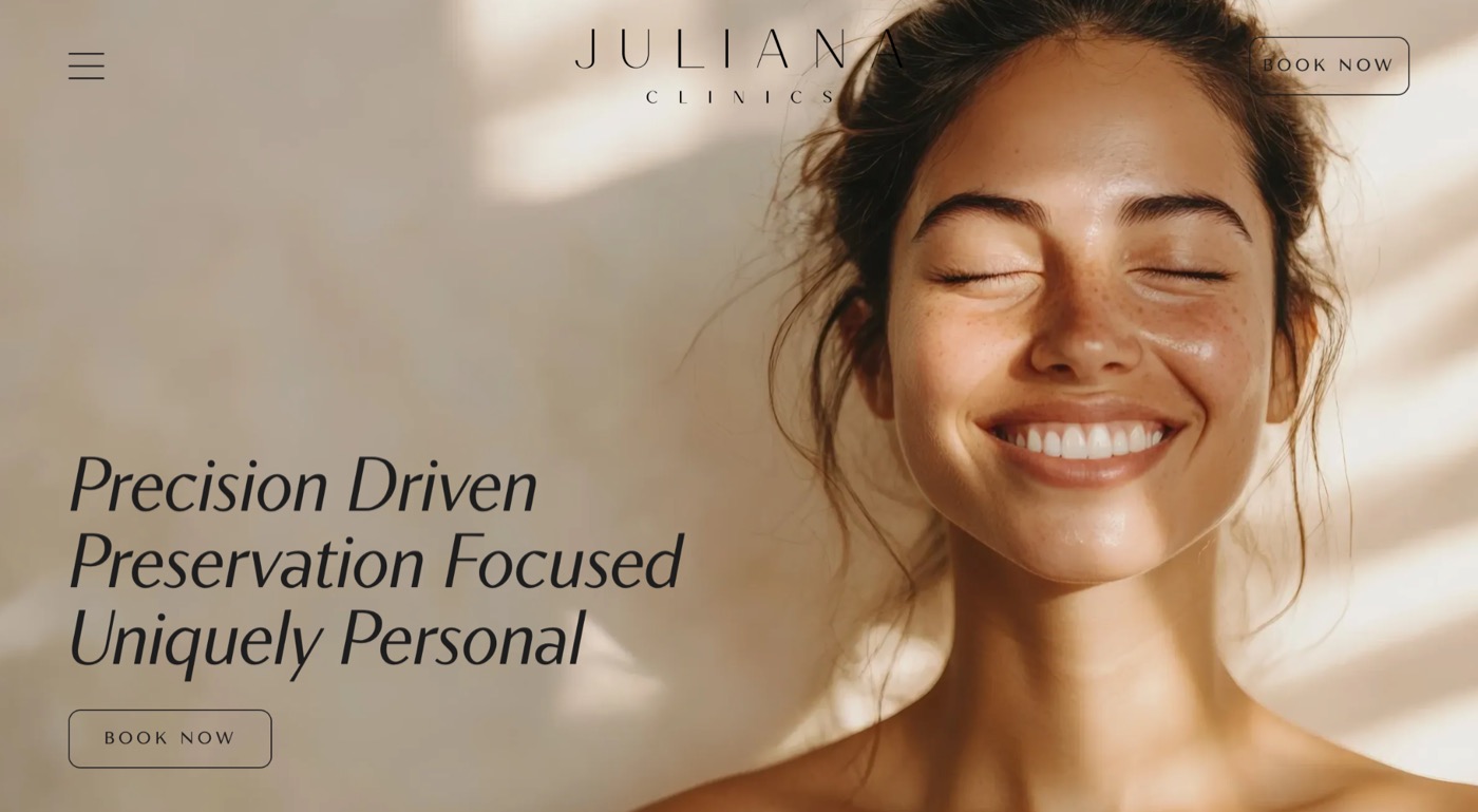
Juliana Clinics delivers one of our favourite homepage heroes.
Instead of heavily posed photography, the website uses natural light and a genuinely joyful expression paired with elegant italic serif typography. The result feels much more editorial than stock photography, immediately creating an emotional connection while reinforcing the premium positioning of the brand.
It’s a great example of how authentic photography can elevate an entire website, and that emotional connection happens in the first few seconds, well before a visitor reads a single treatment description, which is often when those first impressions around trust begin to form.
AURĀE
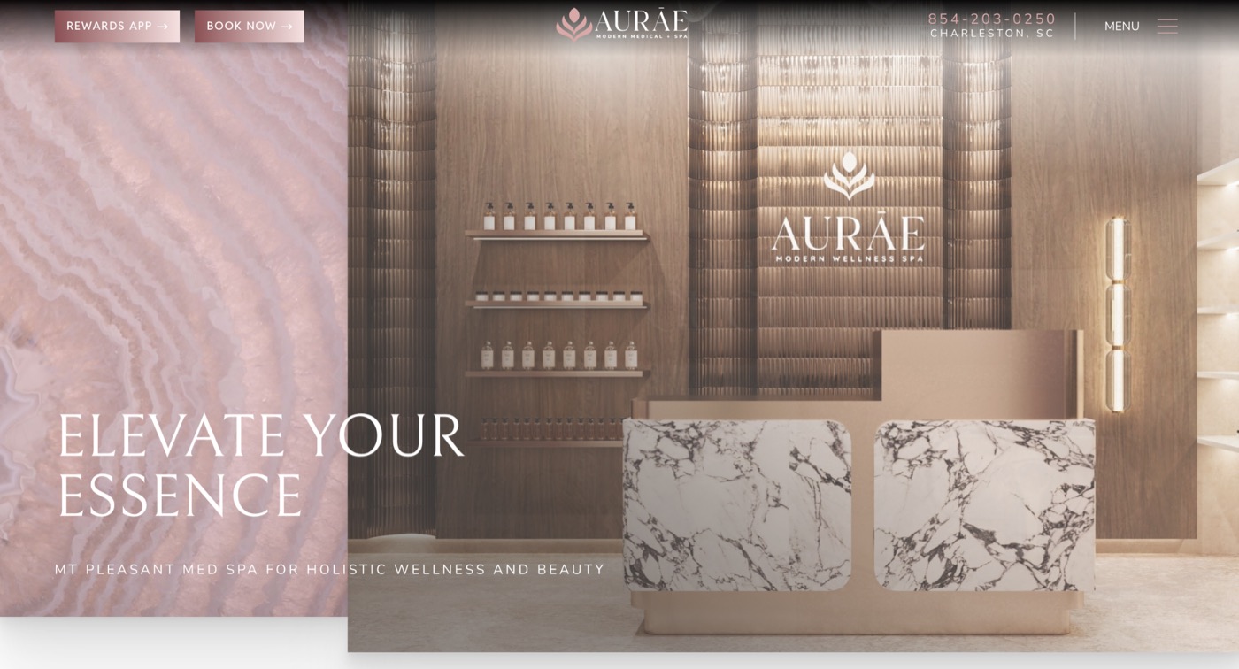
AURĀE demonstrates how medical credibility and luxury branding can comfortably exist together.
Despite offering wellness, medical, and aesthetic services, the website maintains a cohesive visual identity throughout. Clear navigation, thoughtful content organisation, and sophisticated branding make it easy for patients to move between service categories without the experience ever feeling fragmented, so a patient who came in for one treatment can browse into another without ever feeling like they’ve left one brand and wandered into a different one.
GoodSkin
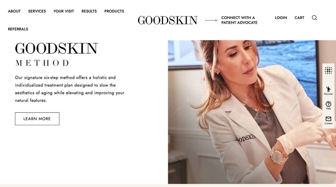
GoodSkin feels less like a traditional med spa website and more like a luxury beauty campaign.
The homepage celebrates the brand’s tenth anniversary using oversized editorial typography layered directly over full-screen photography and video, creating immediate visual impact. Further down, sections like The GoodSkin Method combine bold and italic serif typography with subtle interactive elements, including animated floating labels, to create movement without cluttering the experience.
It’s one of the strongest examples of fashion-inspired branding we’ve seen in aesthetics, and that campaign-level polish establishes a premium perception long before a visitor reaches a treatment price.
JECT
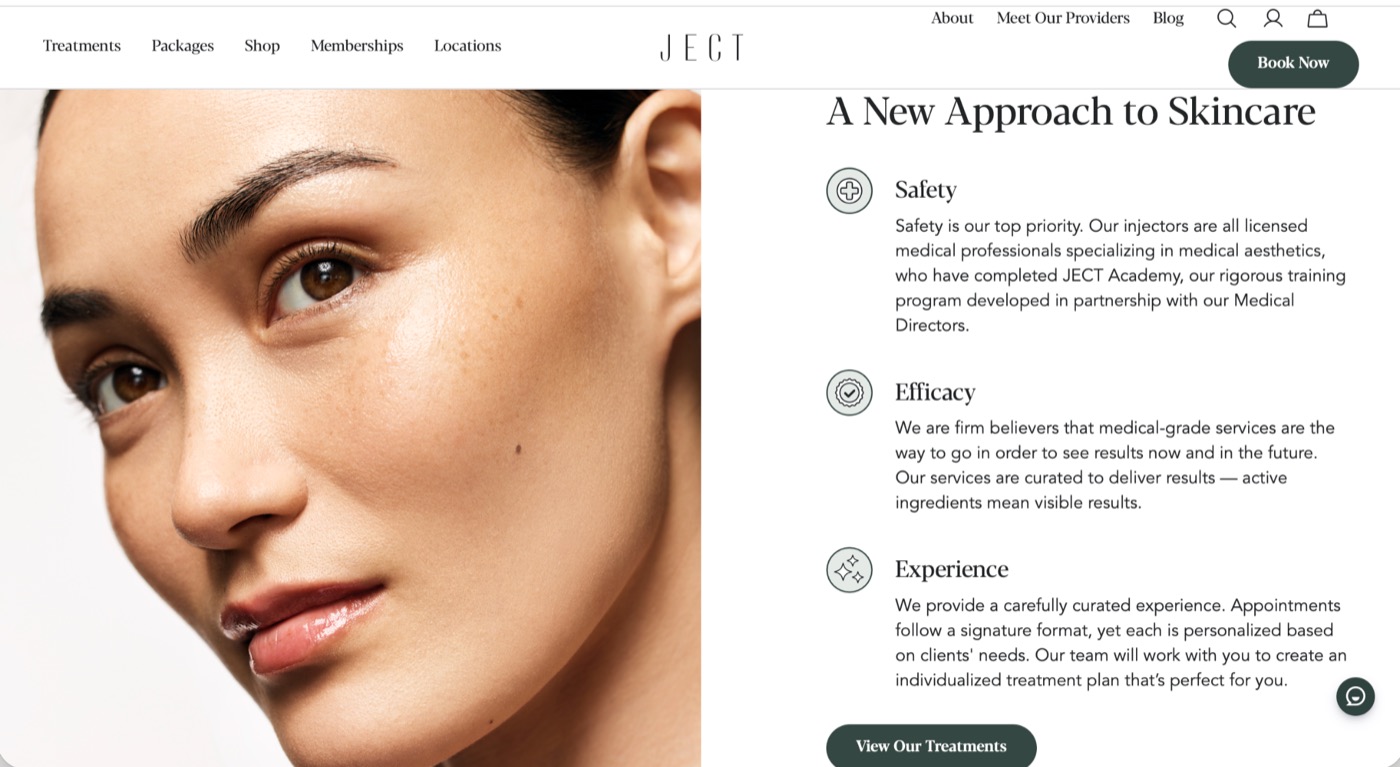
JECT has built one of the most recognisable visual identities in the industry.
The spaced-letter logo, understated colour palette, and warm portrait photography feel confident without trying too hard. Forest-green call-to-action buttons provide just enough contrast against soft neutral backgrounds, while the navigation immediately communicates the scale of the business through sections for locations, memberships, and shopping.
It feels less like a single clinic and more like an established national brand. And that scale can become a trust signal of its own, especially for patients who already recognize the brand from another market.
Airem
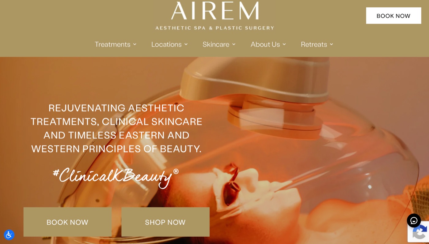
Airem finishes the list with one of the most distinctive homepage experiences.
Rather than relying on perfectly posed portraits, the hero image captures a real treatment in progress beneath a softly lit steam dome, creating a documentary-style authenticity that’s uncommon in aesthetics. Combined with the olive-toned navigation and an unexpected “Retreats” menu item, the website immediately communicates a broader wellness philosophy that extends beyond traditional med spa services.
It’s subtle, memorable, and refreshingly different, and giving “Retreats” a spot in the main nav, rather than burying it as a footnote, signals a broader, higher-end wellness philosophy that sets Airem apart from a practice offering one-off treatments à la carte.
What the best med spa websites have in common.
Although each practice has its own personality, the best med spa websites consistently use design as a conversion tool, not just a visual one.
- They make treatments easy to understand.
- They communicate expertise through photography and layout before a patient reads a word.
- They place trust signals exactly where a decision is being made.
- They make taking the next step feel obvious, no matter how far a visitor has scrolled.
None of these websites succeeds because of one specific design feature. Their strength comes from how branding, photography, layout, and calls to action all work together to move a visitor from curious to confident to booked.
That consistency is often what separates a beautiful website from one that consistently generates consultations.
Frequently asked questions.
What makes a med spa website’s design effective at converting visitors into patients?
Effective design removes friction at every step. That means clear visual positioning in the first few seconds, photography that builds trust before the copy does, layouts that match how patients actually think about treatments (by concern or goal, not just by name), and a consistent, always-visible path to booking.
Does photography really affect whether someone books?
Yes. Authentic provider and treatment photography lowers the anxiety patients feel before a first visit, often before they’ve read a single line of copy. Sites that use real interiors, real providers, or genuinely candid expressions tend to build trust faster than those relying on generic stock imagery.
Should a med spa website follow design trends, or aim to stand out?
Standing out wins more often than following trends. The sites in this list that break from the typical med spa look — bold typography, unconventional colour, real interior photography — tend to be more memorable, which matters when a patient is comparing several practices before deciding where to book.
Where should trust signals like reviews and credentials go?
As close to the decision point as possible. A star rating next to a provider’s bio, or a press mention right under the homepage intro, does more conversion work than the same information buried on a separate About page.
How often should a med spa revisit its website design?
Full redesigns typically make sense every three to four years, but that’s not the whole answer. Between rebuilds, plan on a photography refresh every 12 to 18 months, quarterly service page audits to catch new treatments or outdated pricing, and an annual review of the booking flow and mobile experience. Certain moments should trigger a review whether the calendar says so or not — a major service launch, a rebrand, a new location, or a noticeable drop in conversions from organic traffic.
Build a website patients want to book from.
The best med spa websites succeed because every design decision is built around moving a visitor toward a decision, from first impression to consultation request.
At Aesthera Marketing, we design websites exclusively for aesthetic practices. Every decision — from branding and photography to layout and conversion strategy — is built around helping the right patients find your practice and feel confident taking the next step.
If you’re ready to build a website that works as hard as the rest of your marketing, book a free strategy session with our team. We’ll review your current website, identify opportunities to improve both design and conversion performance, and show you what one of the best med spa websites in your market could look like.

Emily Olsen
Director of Operations at Aesthera Marketing, helping aesthetic practices grow with marketing that actually books patients.